The Road to a New Design System
Written by
March 24, 2022
|
Approximately a 00 minutes read
Design
What do companies like Uber, Salesforce, Airbnb and Twilio have in common? Well, probably a few things, but for one they all have established world class design systems, enabling them to create awesome digital experiences. In this article we share our experiences developing our own design system.
Creating a design system from scratch is no easy task. For starters, the whole concept is relatively new, so there are not a whole bunch of people with lots of experience creating them. Also, there are so many things you need to decide on before even starting with actual development, making even the thought of beginning on a design system quite daunting.
However, in our experience, after a while things start to flow pretty seamlessly. As most writers could agree on, the whole trick is to just start writing, without neccessarily having landed all decisions up front. You will probably have to scrap the first few pages you wrote later anyway, but the thought process has begun. As it turns out, the same goes for developing a design system.
Not everyone reading this article may have a clear picture of exactly what a design system is. Therefore, in this article we look into what design systems are and why we need them, sharing some key experiences we have made while developing Bifrost, our own design system, along the way.
A brief history of web design
In the earliest days of web development, developers had to create functional web pages using only HTML. After a few years CSS came along with easier and better styling of web pages, and thus web design was born. While HTML and CSS still are the fundamental building blocks of the internet, the introduction of JavaScript enabled developers to add functionality and behavior to their websites far beyond the reach of HTML and CSS only—it was now possible to create web pages that felt increasingly like native desktop apps.
Further down the road, the introduction of JavaScript frameworks like React, Angular and Vue took web design a leap forward, as they allowed developers to implement structure, design, behavior and animation to all the elements in a modern web page. Furthermore, these frameworks enabled organizations to create comprehensive design frameworks with sets of reusable code components ready to be used by developers. By combining these component libraries with style guides, pattern libraries and more abstract ideas like brand identity, design systems were born.

At this point, nearly all major tech companies have established design systems. Among the first ones to lauch theirs were companies like Salesforce (Lightning), Google (Material) and Atlassian. They also created a precedent for making their design systems public, allowing other designers and companies to learn from their ideas. This practice has been taken on by Norwegian companies as well, such as Ruter, SpareBank 1 and Entur, who all have chosen to have publically available design systems. At Intility we have also followed in the tracks of the first movers, making our own design system, Bifrost, publically available and all components available in the npm package registry. (Although we haven't yet, we also plan on going full open source, publishing our code available for eveyone on GitHub.)
What is a design system?
Well, that is not entirely simple to explain. Is it a style guide? Yes.. and no. Is it a component library? Yes.. and no. Is it a pattern library? As you may have guessed; yes.. and no. It is actually all of the above, and then some.
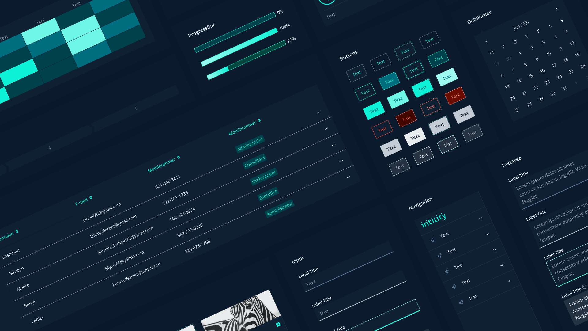
It is common to describe a design system as a large box of Lego pieces, that comes along with (hopefully) easy-to-use guidelines on how to assemble the pieces to make awesome digital experiences. Some of the pieces are really small, serving a tiny purpose, while other pieces are modules themselves made up by several smaller pieces, creating new ways to use them.
A design system contains components, pattern libraries and style guides needed to build a wide range of unique serivces.
One piece (or hereafter component) could be as small as a button or an input field, while another one could be a multifunctional table or even a whole web page. The whole point is that they can be used again and again, by developers working on entirely different products and teams, saving lots of time and effort while at the same time making sure that everything not only looks great, but also consistent across the organization. Since a component only has to be made once across the whole organization, much more effort can be put into the behavior, styling and functionality of that component, compared to a setting where each team must produce the same component from scratch.
How to get started
Before we started developing components, there were a few things we had to decide on. We needed a color palette; we needed typography; we needed a grid system for responsive web apps (meaning they work well on all screen sizes and devices); we needed icons and so forth. We needed the general rules and principles that would be the foundation of the design system.
Perhaps most importantly, we had to decide what our key objectives with the design system were. We landed on the following objectives:
- Making collaboration across development teams easier, by standardizing frontend development concepts and components.
- Enabling development teams to produce digital experiences and releasing new functionality faster than before.
- Creating a similar look and feel on all of Intility's services.
After putting together a team of UX designers and frontend developers, and after hours of meetings, workshops and discussions, we landed on a baseline for colors, typography, spacing and icons, as well as some basic design principles. The grid system would be defined a while later. A lot of effort was made ensuring that all colors in all typography sizes met WCAG requirements for accessibility, and designing a setting for dark mode that worked by simply flipping all colors from their light mode version to the corresponding color in dark mode. (A way more complex task than one might think.)
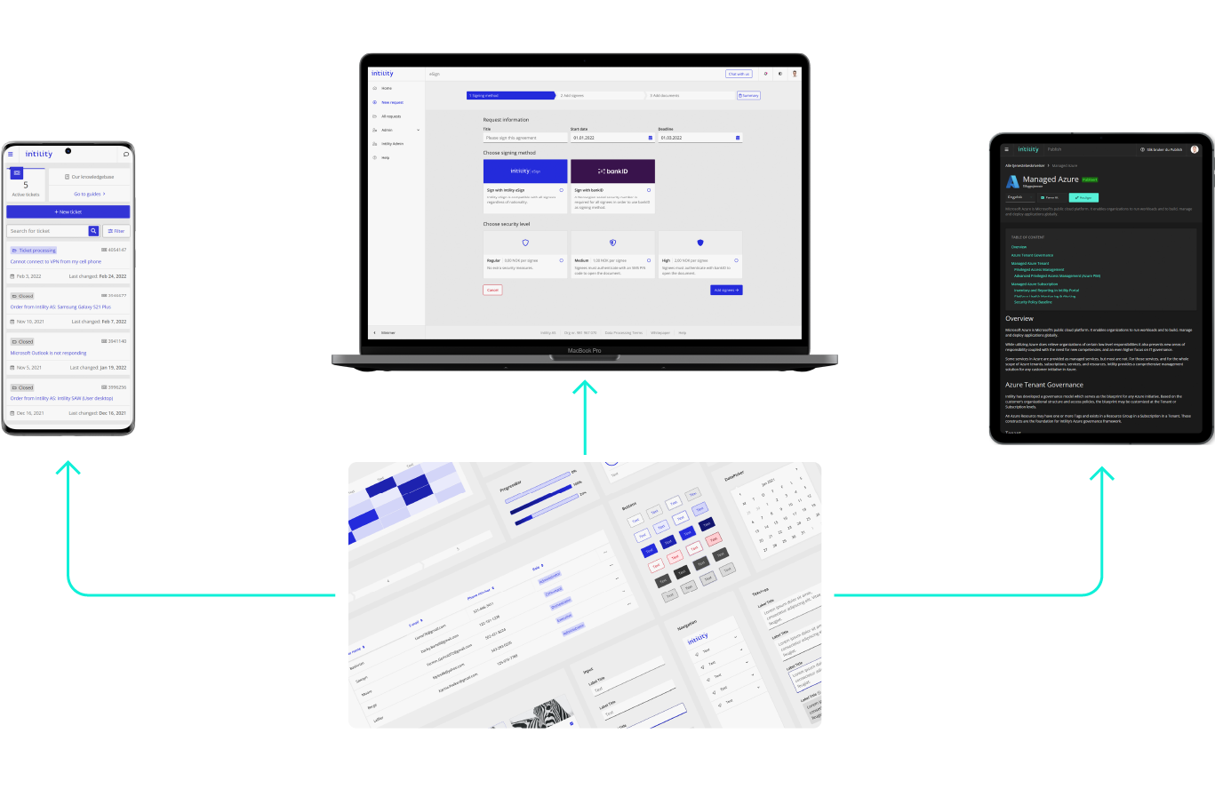
Built-in responsiveness and themes are key features of the Bifrost design system.
As it turns out, most of the things we initially decided on was later scrapped, but as we discussed earlier the whole idea was getting to a point where we could actually start developing the design system.
The UX team started defining the key components that "all" web apps needs; buttons, checkboxes, input fields, tables, tabs, modals and so on. One important thing to remember, which makes the design task much more complex, is that each component must come with states for what they should look like when you hover them, while they are clicked, after they are clicked, if you focus on them with the keyboard and so forth. In addition, all components must be made responsive, so that they are ready to be implemented in responsive web applications. After a while, we had made a pretty good structure for how each component should be designed and handed off to the development team.
Before launching the initial version of Bifrost, we also added a responsive navigation framework for web applications, consisting of a menu sidebar and a top bar premade with a user profile image and settings for switching between languages and light/dark mode.
Code example
So what does a component actually look like, and how do developers use them? We'll use our Accordion component as an example. Accordions have many use cases, and are often used on FAQ-pages. The Bifrost accordion looks like this:
That looks nice and simple. Now, the code for the accordion isn't fully as simple:
const Accordion: AccordionType = forwardRef<HTMLDivElement, AccordionProps>(
  ({ children,className, active, onChange, noBorder, variant, mode, ...props }, ref ) => {
    const [activeKey, setActiveKey] = useState()
    const handleToggle = useCallback(
      activeKey => {
        if (onChange) {
          onChange(activeKey)
        } else {
          setActiveKey(activeKey)
        }
      },
      [activeKey, setActiveKey, onChange]
    )
    const context = useMemo(() => {
      return {
        activeItem: onChange ? active : activeKey,
        onToggle: handleToggle,
        variant
      }
    }, [activeKey, handleToggle, active, variant])
    return (
      <AccordionContext.Provider value={context}>
        <div
          ref={ref}
          data-testid='bf-accordion-container'
          className={classNames(className, 'bf-accordion-container', {
            'bf-accordion-noborder': noBorder,
            'bf-accordion-styled': variant === 'styled',
            'bf-accordion-compact': mode === 'compact',
            'bf-accordion-responsive': mode === 'responsive'
          })}
          {...props}
        >
          {children}
        </div>
      </AccordionContext.Provider>
    )
  }
)
Luckily, since this is a Bifrost component, the Bifrost team has done everything needed for developers to use it in their projects. To use the accordion component in a project, all a developer has to do is import the Bifrost component and render it with a few lines of code. In the code editor below, you can see how it works and play around with the code. (If you want to play around with all Bifrost compoments, go to the Bifrost web page, which has a code editor with a live code preview built in. Just click "Edit code" below any component and have a go. Don't worry—you won't break anything.)
As you may have spotted from the code example above, it mainly consists of the text you actually want to show inside the accordion, as the accordion component comes loaded with everything you need regarding functionality, styling and animations. It doesn't get much simpler than that!
Encouraging adoption
Okay, so now the key elements of our design system were in place and launched in an initial version. Now, how do we get developers to embrace it?
We are in a lucky positition, since it is basically the same team that has developed Bifrost that also develops Intility Portal. In fact, the ongoing process of refurbishing and modernizing Intility Portal was the whole process that first induced the need of a design system. It was always the plan that the new Intility Portal would rely heavily on the new design system, and so Intility's arguably largest frontend development project already hade a stake in Bifrost. Other development teams followed after pretty quickly, realizing the potential of a design system without much encouragement needed from our side.
Then again, why wouldn't you? The benefits of a design system are pretty undeniable, as it allows for reuse of components, saving time, effort and money, while at the same time enhancing user experience. UX designers are happy because they have styleguides and components helping them designing new services and products, developers are happy because they have a component library with advanced components working out of the box, service designers are happy because creating awesome digital experiences is easier than never before, and the combined happiness and timesaving of these people should make the leadership happy as well.

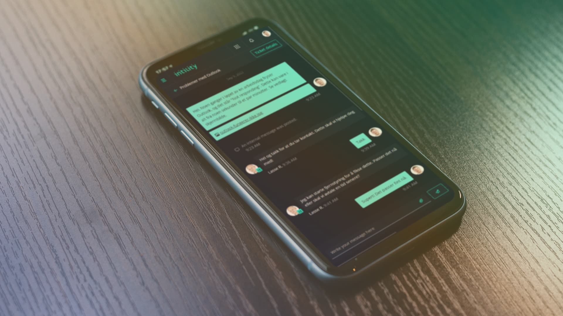
My Intility relies heavily on the Bifrost Design System
Continuously reviewing and adding functionality
Since our initial 1.0-version was launched one and a half years ago, we have made about 30 releases, probably quadrupling the functionality from the first release. Most of the components from the initial release have since been reviewed, redesigned and redeveloped many times, as we have gotten feedback and practical experiences with using them in projects. We also needed to release a 2.0-version pretty quickly, as we needed to add some breaking changes to the navigational component sooner rather than later, before adoption was too high.
Since the initial release, we have added a responsive grid system, as discussed earlier, as well as datepickers, breadcrumbs, stepbars, drawers, pagination, accordions, tooltips, scrollbars, dropdowns, badges, skeletons, spinners and React hooks, to name but a few, saving even more time and effort from developers across the organization. As more and more development teams use Bifrost and the more constructive feedback we get, the more efficient it becomes. We have also encouraged other development teams at Intility to contribute to the design system, as we want it to be as collaborative and transparent as possible.
Are we done?
By no means—we are just getting started. Design systems are constantly evolving, and we will continue to release new components and updated styleguides regularly. A design system is no end game in itself, it is merely a way to enable an organization to create awesome digital experiences. As the market and technology changes, so too must the design system, making the whole concept of a design system more of an "organizational lifestyle" than a finite product.
Want to hear more about our design system? Contact us on [email protected]. We would love to hear from you!
if (wantUpdates == true) {followIntilityOnLinkedIn();}
Other Articles


Platform
June 26, 2026
Beyond Intelligence: Benchmarking Speed and Cost of Self-Hosted vs. Frontier LLMs

Erfan Mohammadi